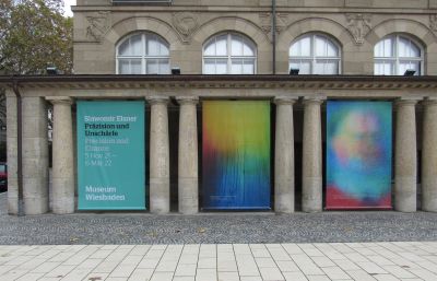
Sławomir Elsner. Precision and Chance
Mediathek Sorted
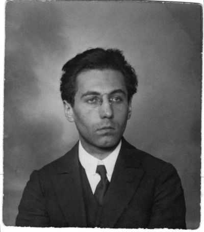
![Sławomir Elsner at the exhibition at the Museum Wiesbaden, 2021 (Alexej von Jawlensky in the background: Spanierin [Spanish Lady], 1913) Sławomir Elsner at the exhibition at the Museum Wiesbaden, 2021 (Alexej von Jawlensky in the background: Spanierin [Spanish Lady], 1913)](/sites/default/files/styles/width_100_tiles/public/Titelbild_23.jpg?itok=J58T-JmV)
Often underrated in general observation, watercolour painting is one of the most complicated artistic techniques. In controlling the colour density, the wet progressions, the transparent colour overlaps and the drying of the paper that contracts and undulates at the end, the expressionists, particularly Emil Nolde, showed extreme mastery. Of course, we know of tours de force in this technique, from Albrecht Dürer, William Turner to Paul Cézanne and Paul Klee right up to Maria Lassnig. But still, in the last one hundred years, coloured-pencil drawing and watercolour painting are more likely to be found in academic art education. These techniques, which have recently been neglected in professional art at the highest level and in a large format, are brought to life by Elsner so that they can be experienced sensually again.
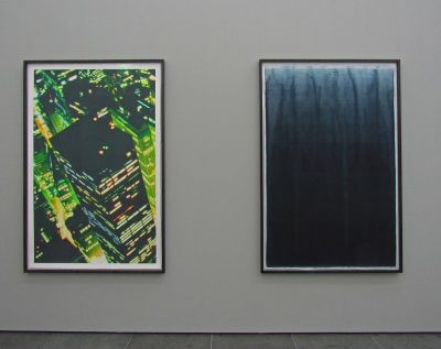
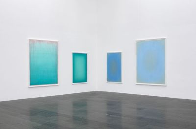
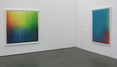
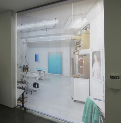
In his watercolours, sometimes in wall-filling formats, Elsner creates abstract colour spaces, which vary a shade or two (not necessarily complementary) colours in lightness, density and progressions (Fig. 16–18 . ), thematise centred clouds of light or horizons (Fig. 19–20 . ) or orient themselves on the spectrum of the colour wheel (Fig. 21–23 . ). But the artist also brings other colour combinations and light constellations into the consciousness again. With clearly visible (or surprisingly also completely invisible ) footprints of the artistic processes, Elsner adds new insights values, “experienced reality”, to the experiences derived from nature. Whoever connects specific colours or their combinations, especially in the intensity presented by Elsner, with feelings and emotions, can invoke Goethe’s “theory of colours” and its repercussions in modern colour psychology.
Parallels with the colour-field painting of the American artists of the 1950s and 1960s, such as Barnett Newman, Mark Rothko or Ad Reinhardt, or the German painters Gotthard Graubner and Rupprecht Geiger, cannot be ignored. However, we can connect numerous differentiated, content-based approaches and other artistic techniques, which have only a peripheral link to those of Elsner, to all forerunners, which all dealt with oil painting and, like Geiger, with screen printing. If Elsner is compared with Geiger for example, in his large-format paintings we can also find colour and light displacements and dynamic colour spaces, which, however, in terms of content, correlate to mental implications, such as power, energy, love, warmth and strength. The print areas of Geiger’s serigraphies are so sensitive that touching them destroys their integrity. As far as the technique is concerned, Elsner’s watercolours here are more worldly, more haptic and gripping without losing their aesthetic differentiation, radiance and intellectuality. The sixteen pieces displayed in the exhibition belong to one of his most extensive groups of works, which has been developed since 2015, and, according to the catalogue raisonné, currently comprises over ninety works of different formats.
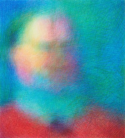
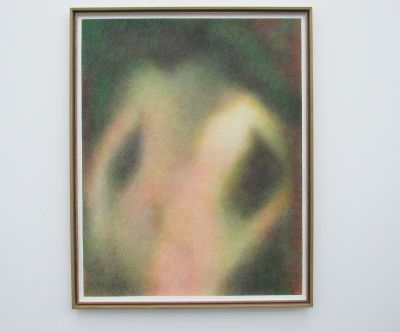
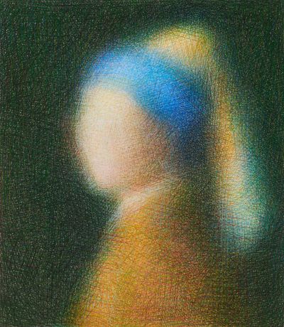
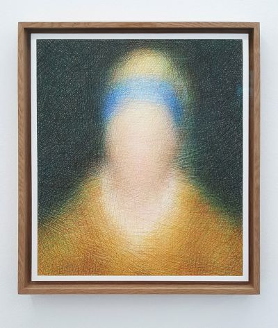
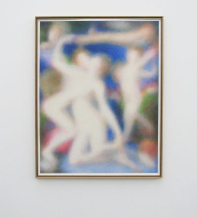
In 2014 and based on older studies, Elsner began to carry out artistic analyses of famous paintings from European and American museums in the form of coloured-pencil drawings, which had the same format as the corresponding oil paintings (Fig. 24–33 . ). He does not, however, copy the respective subject and the narrative details, but instead conveys the colour distribution and the light direction of the originals to exceptionally blurred looking fabric comprising fine coloured lines. It is this group of works which the exhibition “Precision and Chance” has to thank for its name and about which Anne-Marie Bonnet ,in her catalogue article “Paradoxien der Schönheit” [Paradoxes of Beauty], quite rightly asks what actually is exact or “precise” about them: “It is more like a mesh, a grid, a thick fabric of strokes in which there are no individual, characteristic or contouring lines, as we are used to in drawings. Although each stroke is sharp, it does not signify anything on its own, only unfolding its effect in interaction with other strokes, with a different colour, placed differently; this is how diffuse colour moods, changing nuances arise. No colour is used, instead colour and light zones are created.”






























![Sławomir Elsner at the exhibition at the Museum Wiesbaden, 2021 (Alexej von Jawlensky in the background: Spanierin [Spanish Lady], 1913) Sławomir Elsner at the exhibition at the Museum Wiesbaden, 2021 (Alexej von Jawlensky in the background: Spanierin [Spanish Lady], 1913)](/sites/default/files/styles/width_800px/public/Titelbild_23.jpg?itok=31IcSIIx)
